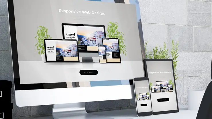
In an online realm brimming with websites vying for attention, understanding and applying key web design principles is critical for ensuring your site stands apart, engaging visitors effectively and turning them into customers. This brief guide was inspired by design principles based on contributions from professionals in industries as diverse as psychology and behavioral science, physics, ergonomics, and more. We’ll outline essential design strategies that enhance both aesthetics and usability, driving meaningful conversions.
Understanding Website Design Principles in web design is an intricate blend of art and science, drawing on diverse fields like psychology, physics, and ergonomics to create intuitive and appealing digital spaces. These design principles act as flexible guidelines, aiding designers in choosing and organizing elements to craft experiences that are as efficient as they are visually compelling. Adhering to these principles not only elevates the user experience (UX) and user interface (UI) but also boosts conversion rates. A prime example is Google, which saw usage surge after embracing simplicity, a cornerstone of effective design.
The core of effective website design while definitions of design principles vary, there are universally recognized best practices that apply across the board. Here, we delve into popular design principles backed by scientific research and expert opinions.
The 10 UX Laws Jon Yablonski, in his book “Laws of UX,” outlines design laws based on psychological insights that every designer should familiarize themselves with:
Fitts’s Law: Optimize Main Actionable Targets for Easy Access

Fitts’s Law is a principle from human-computer interaction that predicts the time required to rapidly move to a target area is a function of the ratio between the distance to the target and the size of the target. This law implies that the larger and closer a target, the faster and easier it is to select. In website design, applying Fitts’s Law involves optimizing the placement and sizing of main actionable targets—such as buttons, links, and interactive elements—to ensure they are easy for users to access and interact with. By considering this principle, designers can enhance user experience, reduce effort and time for task completion, and increase overall site usability.
For example, in mobile design, clickable icons must be large enough to facilitate easy tapping. Introducing extra spacing between buttons significantly reduces the likelihood of users accidentally selecting the wrong icon.
Optimal spacing and size reduce errors and enhance usability, especially on mobile devices. A recommended practice is to adhere to a minimum clickable area of 40 x 40 pixels in mobile designs.
Applying Fitts’s Law in Website Design:
- Navigation Buttons and Links: Ensure that primary navigation controls are prominently sized and positioned within easy reach of users, such as in the header or sidebar. Larger buttons or links are easier to click, reducing user frustration and improving navigation efficiency.
- Call-to-Action (CTA) Buttons: Critical CTA buttons, like “Buy Now,” “Sign Up,” or “Learn More,” should be large enough to be easily clickable and placed in positions where users naturally focus their attention, such as the center of the screen or at the end of content sections.
- Interactive Elements: Interactive elements, including dropdown menus, sliders, and form fields, should be adequately sized and located in areas of the webpage that do not require excessive mouse movements or precision to access, thereby streamlining user interactions.
- Mobile Responsiveness: Considering Fitts’s Law is crucial for mobile website design, where touch targets must be sized and spaced to accommodate finger taps. Ensuring that buttons and interactive elements are easily tappable without accidental activations enhances mobile user experience.
- Scrolling and Pagination: Implementing easily clickable arrows or adequately spaced pagination links for scrolling through content or navigating between pages can minimize user effort. Placing these elements near the content they control or at both the top and bottom of long pages can improve accessibility.
By integrating Fitts’s Law into website design principles, designers can create more user-friendly interfaces that cater to the natural motor capabilities and limitations of users. Optimizing the size and location of actionable targets not only facilitates smoother interactions but also contributes to a more efficient and satisfying user journey on the website.
Hick’s Law Minimize User Choices
Simplify user choices to streamline interactions.
Have you ever felt so overwhelmed by numerous options that making a decision became a struggle? This paralysis from choice overload exemplifies Hick’s Law. Essentially, the greater and more complex the array of choices, the longer it takes for users to make a decision.
Hick’s Law, a principle derived from cognitive psychology, states that the time it takes for an individual to make a decision is directly proportional to the number and complexity of choices available. In the context of website design, this law suggests that minimizing the number of user choices can streamline decision-making processes, reduce cognitive load, and enhance user experience.
By simplifying interfaces and reducing the options users must navigate, designers can facilitate quicker and more confident decision-making, leading to a more efficient and satisfying interaction with the website.
Applying Hick’s Law in Website Design:
- Simplified Navigation Menus: Design navigation menus with fewer items to reduce decision time and help users find their desired content more quickly. A focused menu drives users directly to the most important sections without overwhelming them with too many options.
- Streamlined Forms: When designing forms, limit the number of fields and options to those absolutely necessary. This reduces the cognitive effort required to fill them out and increases the likelihood of completion.
- Limited Product Choices: For e-commerce sites, curate product selections or use filtering options to present a manageable number of products at any time. This can prevent choice paralysis, where too many options lead to indecision and potential abandonment.
- Clear Call-to-Action (CTA) Buttons: Avoid cluttering pages with multiple competing CTAs. Instead, focus on one or two primary actions you want users to take. This clarity helps users make quicker decisions without feeling overwhelmed.
- Consolidated Content Categories: Organize content into clear, broad categories rather than numerous, narrowly defined ones. This approach helps users navigate the site more intuitively, making the process of finding information faster and less daunting.
- Decision Aids: Implement tools like comparison charts, product filters, or personalized recommendations to help users make choices more efficiently. These aids can reduce the perceived complexity of decisions by narrowing down options based on user preferences or criteria.
By thoughtfully applying Hick’s Law to website design, designers can create more user-friendly environments that minimize cognitive strain and decision fatigue. Simplifying choices and streamlining interactions not only improves usability but also enhances the overall satisfaction of users by making their online journeys quicker and more straightforward.
Gestalt laws: Group Related Elements Together

The Gestalt laws of perceptual organization are a set of principles that describe how humans naturally group elements together to make sense of complex visual scenes. One of these principles focuses on the tendency to perceive elements that are physically close to each other as part of the same group.
In website design, applying the Gestalt laws, particularly the principle of grouping related elements together, can significantly enhance user experience by making information easier to process and understand. By thoughtfully organizing content and design elements, designers can guide users’ perceptions and interactions in a way that feels intuitive and effortless.
Applying Gestalt Laws to Group Related Elements in Website Design:
- Proximity in Navigation Menus: Group related items closely together in navigation menus to indicate their relationship. This helps users quickly understand how your site is organized and find the information they need more efficiently.
- Visual Hierarchy: Use spacing and alignment to create visual clusters of related content. For example, grouping text with corresponding images or buttons creates a clear association between them, making the content easier to digest.
- Consistent Design Elements: Apply consistent visual styles (such as color, shape, or typography) to elements that serve similar functions or convey related information. This visual consistency helps users recognize patterns and navigate your site more intuitively.
- Content Grouping on Pages: Organize content into clearly defined sections or blocks, using headings, borders, or background colors to visually separate different topics or categories. This not only improves readability but also helps users identify related content at a glance.
- Interactive Element Grouping: Place interactive elements like buttons, links, or form fields that contribute to the same function or goal near each other. This proximity indicates their relatedness and guides users through interactions smoothly.
- Whitespace Utilization: Use whitespace strategically to group elements together or separate them. Adequate spacing around groups of related items makes these relationships more apparent and focuses users’ attention where it’s most needed.
By leveraging the Gestalt laws to group related elements together on websites, designers can create environments that align with natural human perceptual tendencies. This approach simplifies the user’s cognitive workload, making websites more navigable, content more comprehensible, and overall interactions more satisfying. Thoughtful grouping and organization foster a coherent user experience, encouraging engagement and facilitating task completion with greater ease.
Jakob’s Law: Stick to Familiar Conventions

Jakob’s Law, proposed by usability expert Jakob Nielsen, emphasizes the importance of adhering to familiar design conventions in web design. This principle suggests that users spend most of their time on other websites and platforms, becoming accustomed to certain design patterns and interactions. By following established conventions and standards, designers can leverage users’ existing knowledge and expectations to create intuitive and user-friendly interfaces. Sticking to familiar conventions not only enhances usability but also contributes to a more seamless and comfortable user experience.
Applying Jakob’s Law in Website Design:
- Navigation Consistency: Maintain consistent navigation structures across webpages to help users easily locate information. Familiar placement of menus, buttons, and links reduces cognitive effort and allows users to navigate your site with confidence.
- Standardized Icons and Symbols: Use commonly recognized icons and symbols for actions like “home,” “search,” or “menu” to ensure users understand their functions immediately. Familiarity with these visual cues promotes efficient interaction.
- Responsive Design Patterns: Implement responsive design practices that align with industry standards to provide a consistent user experience across devices. Adhering to familiar responsive patterns helps users seamlessly transition between different screen sizes.
- Form Design Conventions: Follow well-established form design principles, such as labeling fields clearly, placing labels above inputs, and using standard input types, to create forms that users are familiar with. This reduces confusion and errors during data entry.
- Content Layout: Organize content in a way that mirrors common reading patterns, such as placing important information at the top and following a left-to-right, top-to-bottom flow. Users are accustomed to scanning content in this manner, making it easier for them to find what they’re looking for.
- Consistent Branding: Maintain brand consistency in terms of colors, typography, and imagery throughout your website. Users should easily recognize your brand identity across various pages and touchpoints, reinforcing familiarity and trust.
By embracing Jakob’s Law and sticking to familiar design conventions in website development, designers can create interfaces that resonate with users’ expectations and behaviors. Leveraging established norms not only enhances usability but also builds user confidence, reduces learning curves, and ultimately improves the overall user experience. Prioritizing familiarity in design choices fosters a sense of comfort and trust among users, leading to more successful interactions and engagements on the website.
Law of Prägnanz: Prefer Simple Structures

The Law of Prägnanz, also known as the Law of Simplicity or the Law of Good Figure, is a foundational principle in Gestalt psychology that highlights the human tendency to perceive and interpret complex stimuli in the simplest, most organized form possible. In the context of design, this law advocates for prioritizing simplicity and clarity in visual compositions to reduce cognitive load and enhance understanding. By embracing simple structures, designers can create more impactful and effective designs that resonate with users, convey information clearly, and facilitate seamless interactions.
Applying the Law of Prägnanz in Website Design:
- Clean Layouts: Opt for clean and uncluttered layouts that emphasize essential elements and minimize distractions. Simple arrangements help users focus on key content and navigate the website with ease.
- Minimalist Design: Embrace minimalist design principles by using white space effectively, simplifying color palettes, and employing concise typography. Minimalism promotes visual clarity and allows for better information hierarchy.
- Intuitive Navigation: Design intuitive navigation menus with clear labels and logical structures to guide users seamlessly through the website. Simple navigation enhances user experience by reducing the effort required to find desired information.
- Consistent Branding: Maintain consistency in branding elements such as logos, colors, and fonts to create a cohesive and recognizable visual identity. Consistent branding simplifies user recognition and fosters trust in the brand.
- Visual Hierarchy: Establish a clear visual hierarchy by prioritizing important content, using headings and formatting to differentiate sections, and employing contrast to highlight key information. A well-defined hierarchy simplifies content consumption and aids user comprehension.
- Mobile Optimization: Ensure that the website is optimized for mobile devices with responsive design techniques that adapt layouts for various screen sizes. Mobile-optimized sites provide a simplified user experience on smaller screens.
By embracing the Law of Prägnanz and favoring simple structures in website design, designers can create interfaces that are visually appealing, easy to navigate, and conducive to effective communication. Simplifying design elements not only enhances user engagement but also fosters a positive user experience by reducing cognitive strain and facilitating seamless interactions. Prioritizing simplicity in design choices enables users to focus on content, promotes clarity of communication, and ultimately contributes to the overall success of the website.
Law of Proximity: Group Elements by Proximity
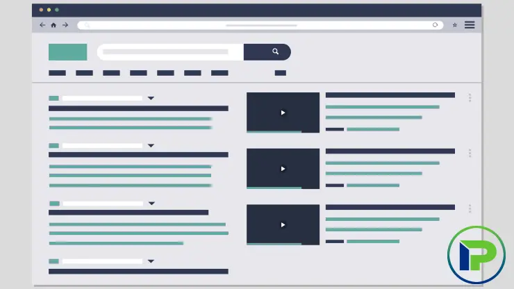
The Law of Proximity, a foundational principle in Gestalt psychology, underscores the human tendency to perceive and group elements that are physically close to each other as part of the same visual unit or category. In web design, leveraging the Law of Proximity involves arranging related elements in close proximity to convey their association and establish visual relationships. By strategically grouping elements based on their proximity, designers can enhance clarity, organization, and user comprehension, ultimately improving the overall usability and effectiveness of the website.
Applying the Law of Proximity in Website Design:
- Logical Grouping: Place related content, links, or buttons in close proximity to each other to signify their connection and relevance. Grouping related elements together visually guides users to understand the relationships between different parts of the interface.
- Form Design: When designing forms, align labels closely with their corresponding input fields to indicate their association. By keeping related elements near each other, users can easily identify which label corresponds to which input.
- Image Galleries: Arrange images in galleries or grids with consistent spacing to imply grouping. Proximity can be used to suggest that images within closer proximity belong to the same category or share a common theme.
- Navigation Menus: Cluster menu items that belong to the same category or section closely together within the navigation structure. This proximity helps users quickly scan and locate specific menu options based on their visual grouping.
- Call-to-Action (CTA) Buttons: Place primary CTAs near relevant content or product descriptions to indicate action points. Proximity can draw attention to key actions and guide users towards conversion paths effectively.
- Content Blocks: Organize content into distinct blocks with appropriate spacing between them to visually separate different sections. Proximity can help users differentiate between content categories and navigate through information more efficiently.
By applying the Law of Proximity and grouping elements based on their closeness in website design, designers can create interfaces that are intuitive, organized, and user-friendly. Leveraging proximity to indicate relationships between elements enhances user understanding, streamlines navigation, and improves overall user experience. Thoughtful consideration of element groupings based on proximity not only enhances visual hierarchy but also aids in guiding users through content and interactions with clarity and coherence.
Usability is about people and how they understand and use things, not about technology.
Law of Similarity: Unite Elements with Similarity
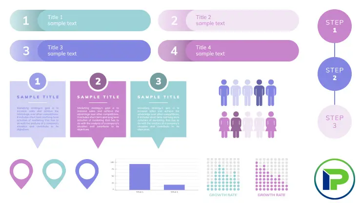
The Law of Similarity, a fundamental concept in Gestalt psychology, posits that elements sharing similar attributes such as shape, color, size, or texture are perceived as belonging together and forming a cohesive group.
In website design, leveraging the Law of Similarity involves uniting elements with shared visual characteristics to convey relationships, hierarchy, and coherence. By applying similarity in design elements, designers can enhance user perception, facilitate information processing, and create visually engaging and intuitive interfaces that resonate with users.
Applying the Law of Similarity in Website Design:
- Color Schemes: In user interfaces (UI) or infographics, different sections or features might be coded with distinct color themes. For instance, all interactive buttons might be designed in blue, while informational text boxes are in green. This visual similarity helps users quickly understand which elements serve similar functions or belong to the same category.
- Consistent Visual Styles: Use consistent colors, fonts, and design elements throughout the website to establish a cohesive visual identity. Consistency in visual styles helps users recognize patterns, navigate the site easily, and associate similar elements with related functions.
- Typography: Typography can also be used to group elements by employing similar font styles for headings, subheadings, and body text related to the same topic or section. For instance, all headings might use the same bold font, making it clear they serve a similar hierarchical role in the content structure.
- Color Coding: Employ color coding to group related elements together or differentiate categories of content. Using similar colors for related items can help users quickly identify connections and understand relationships within the website.
- Iconography: Utilize a consistent set of icons with similar styles and visual characteristics to represent related actions or functions. Icons with similar visual cues enhance recognition and aid users in understanding their meanings intuitively.
- Shapes and Sizes: In product design or branding, products from the same line might share similar shapes but differ in size. This visual cue helps consumers quickly identify products as belonging to the same family, even if their specific functions or sizes differ.
- Button Design: Maintain uniformity in button design by using consistent shapes, colors, and sizes for buttons that perform similar actions. Similar button styles create a clear visual hierarchy and guide users to focus on primary calls-to-action.
- Data Visualization: When presenting data through charts or graphs, use consistent visual elements like color schemes or symbols to represent data categories consistently. Similarity in data visualization aids in interpreting information accurately and efficiently.
- Image Galleries: Display images with similar themes or subject matters in galleries with consistent layouts or styles. Grouping images with similar visual attributes together enhances cohesion and enables users to make connections between related content.
By leveraging the Law of Similarity and uniting elements with shared visual characteristics in website design, designers can create interfaces that are visually harmonious, easy to navigate, and engaging for users. Leveraging similarity in design elements not only enhances aesthetics but also improves user comprehension, navigation, and interaction with the website. Thoughtfully applying similarity principles fosters a sense of unity and coherence in the design, guiding users through content intuitively and enhancing their overall experience on the website.
Law of Uniform Connectedness: Elements that are visually connected are perceived as more related than elements with no connection.
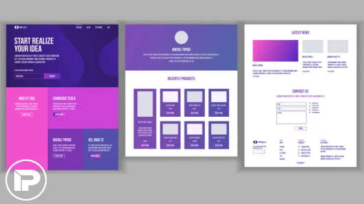
The Law of Uniform Connectedness, a key principle in Gestalt psychology, asserts that elements that are visually connected or grouped together are perceived as more related or belonging to the same category than elements that are not connected. In website design, leveraging the Law of Uniform Connectedness involves using visual connections such as lines, colors, shapes, or other design elements to create associations and communicate relationships between various parts of the interface. By strategically employing visual connections, designers can enhance user perception, improve information comprehension, and create cohesive and intuitive user experiences.
Applying the Law of Uniform Connectedness in Website Design:
- Visual Cues for Relationships: Use consistent visual cues such as lines, borders, or background colors to connect related elements on the interface. Visual connections can help users understand the relationships between different sections or content blocks.
- Interactive Elements: Group interactive elements that serve a similar function or purpose with visual connections like shared backgrounds or borders. This visual cohesion indicates that these elements are related and work together to fulfill a specific task.
- Data Visualization: Connect data points or categories visually in charts or graphs using consistent colors or patterns. By visually linking related data elements, users can easily identify correlations and insights within the data.
- Navigation Paths: Design navigation paths with visual indicators such as arrows, lines, or progress bars to show users the connection between different steps or sections. Visual connections in navigation aid users in understanding their progression through the website.
- Grouping Content: Group related content items together with visual connections like color coding or borders to signify their association. Visually connected content blocks help users distinguish different categories of information and navigate the content more effectively.
- Interactive Feedback: Provide visual feedback for user interactions, such as highlighting linked elements when hovered over. Visual indications of connection and interactivity enhance user engagement and guide users towards interactive elements.
By embracing the Law of Uniform Connectedness and incorporating visual connections between related elements in website design, designers can create interfaces that are coherent, user-friendly, and engaging. Leveraging visual relationships not only enhances aesthetics but also improves information organization, user comprehension, and overall user experience on the website. Thoughtfully utilizing visual connections fosters a sense of unity and continuity in design, guiding users through interactions intuitively and enhancing the overall usability and effectiveness of the website.
Miller’s Law: Presenting information in digestible segments aids memory and understanding.
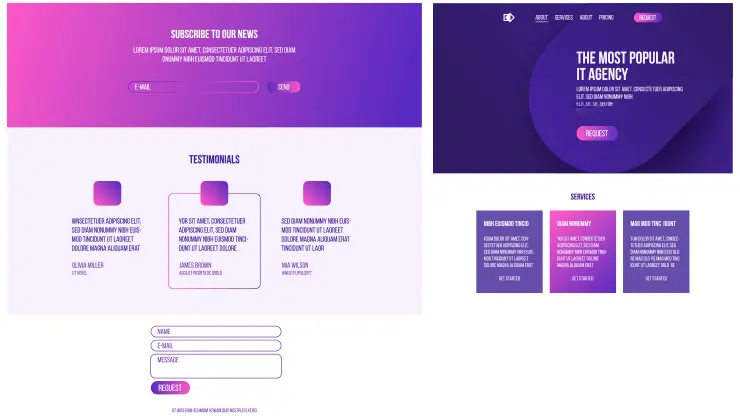
Miller’s Law, a concept derived from cognitive psychology, suggests that individuals can effectively process and retain a limited number of information chunks in their working memory. This theory, often summarized as the ability to hold around seven, plus or minus two, items in mind at once, underscores the importance of breaking down information into manageable segments for optimal memory and comprehension. In website design, adhering to Miller’s Law involves presenting content in concise and digestible portions to facilitate easier processing, enhance retention, and improve overall user understanding.
Applying Miller’s Law in Website Design:
- Chunking Content: Organize textual content into clear sections or paragraphs that focus on one main idea or topic. Breaking down information into digestible chunks makes it easier for users to absorb and remember key points.
- Bullet Points and Lists: Use bullet points or numbered lists to present information in a scannable format. Lists help chunk information into distinct units, making it more manageable for users to scan and comprehend.
- Progressive Disclosure: Implement progressive disclosure techniques to reveal information gradually as users interact with the content. By presenting information in stages, users can focus on one segment at a time, reducing cognitive overload.
- Visual Hierarchy: Structure web pages with a clear visual hierarchy that guides users through the content from most important to least important. Highlighting key information first adheres to Miller’s Law by ensuring that critical details are presented within the limited capacity of working memory.
- Interactive Modules: Break interactive elements or multimedia content into smaller modules that users can engage with sequentially. Dividing interactive features into manageable segments enhances user engagement and comprehension.
- Content Summaries: Provide concise summaries or key takeaways at the beginning or end of sections to reinforce important points. Summarizing content helps users retain crucial information within the constraints of working memory.
By integrating Miller’s Law into website design strategies and presenting information in digestible segments, designers can optimize user engagement, retention, and understanding. Structuring content in a manner that aligns with cognitive limitations enhances usability, reduces cognitive strain, and fosters a more efficient and enjoyable user experience on the website. Prioritizing clear and organized content delivery supports users in processing information effectively and ultimately contributes to the success of the website in conveying key messages and facilitating user interactions.
Serial Position Effect: Users have a propensity to best remember the first and last items in a series.
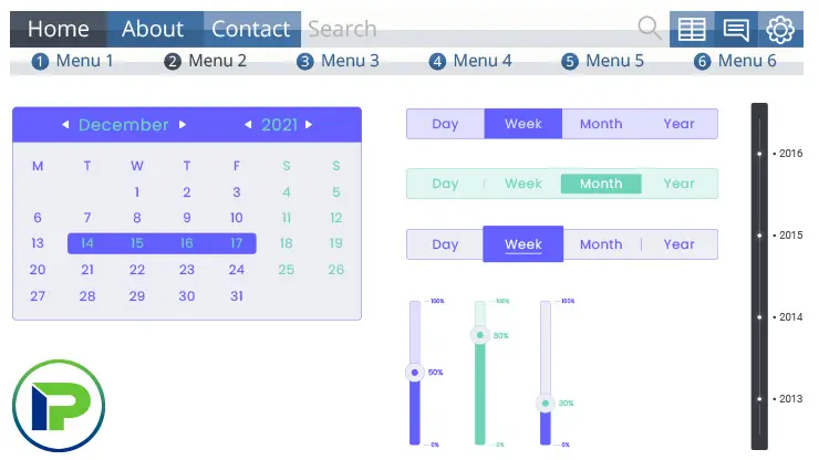
The Serial Position Effect is a cognitive phenomenon indicating that in a sequence of items, individuals are most likely to remember the first (primacy effect) and last (recency effect) items more effectively than those in the middle. This understanding is particularly valuable in website design, where structuring content to align with users’ memory biases can significantly enhance user experience and information retention. By strategically positioning key information at the beginning and end of pages or lists, web designers can ensure that critical content captures and retains users’ attention.
Applying the Serial Position Effect in Website Design:
- Navigation Menus: In designing website navigation menus, placing the most important sections at the beginning and end can improve their visibility and memorability. For instance, home and contact us pages often appear first and last, respectively, making them easy to find.
- Content Layout: When laying out webpage content, introduce critical information or objectives at the beginning and provide a summary or call-to-action at the end. This structure leverages users’ natural memory tendencies to reinforce key messages.
- E-Commerce: For e-commerce sites, highlighting featured products or deals at the start of product listings and repeating important offers or guarantees at the end can capitalize on the Serial Position Effect to boost sales and conversions.
- Forms and Surveys: In online forms or surveys, placing essential questions or fields at the beginning and end can ensure they are more likely to be completed and remembered by users. This can be particularly useful for gathering important user feedback or information.
- Blog Posts and Articles: Within blogs or informational sections, starting with a compelling introduction that outlines key points and ending with a strong conclusion or summary helps ensure that readers retain the most critical information.
By incorporating the Serial Position Effect into website design strategies, designers can create more effective and memorable user experiences. This approach acknowledges the natural patterns of user memory and cognition, optimizing how information is presented and accessed on websites to improve user engagement, satisfaction, and retention of information.
The 10 Usability Commandments by Jakob Nielsen Nielsen’s heuristics offer a foundation for evaluating usability issues, focusing on user empowerment and clear navigation:
- Keep Users Informed: Feedback ensures users understand their interactions’ outcomes.
- Logical and Familiar Information Presentation: Use commonly understood terms and logical structures.
- Enable User Control: Give users the ability to recover from errors easily.
- Adhere to Standards: Familiar layouts and controls reduce the learning curve.
- Error Prevention: Design to minimize user mistakes and provide clear warnings for irreversible actions.
- Keep Essential Information Visible: Avoid demanding users remember information from one part of an interaction to another.
- Support Novice and Expert Users: Design for accessibility while offering shortcuts for experienced users.
- Aesthetic and Minimalist Design: Clutter detracts from key content; simplicity focuses attention.
- Help Users Recognize, Diagnose, and Recover from Errors: Clear, constructive error messages guide users towards resolution.
- Accessible Help: Searchable documentation supports users in solving issues independently.
Implementing design principles in projects while learning these principles might seem daunting, applying them becomes intuitive with practice. Stay abreast of UX best practices, wisely select principles relevant to each project, and continually refine your work based on user feedback and testing.
Website builders, with its design-centric features and widgets, facilitate the application of these concepts, allowing for logical content organization and seamless user experiences.
A deep understanding and effective application of foundational web design principles are pivotal in crafting engaging, user-friendly websites. From Jon Yablonski’s UX laws to Jakob Nielsen’s usability heuristics, these guidelines serve as the backbone of impactful design. Through conscientious application and continuous learning, designers can enhance user satisfaction and drive conversions, firmly establishing their projects as paragons of effective web design.
By exploring the insights provided, learning from available resources like us, and adhering to these core principles, you can elevate your web design projects from good to exceptional.
Remember, the goal is to create sites that not only look great but are intuitive, user-centric, and ultimately, successful.


