
Introduction
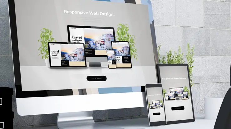
Definition of Responsive Web Design
Responsive Web Design (RWD) is a technique aimed at creating websites that provide an optimal viewing experience across a wide range of devices. This means that whether a user is accessing a site on a mobile phone, tablet, or desktop computer, the website’s layout and content adapt fluidly to fit the screen size. Key components of RWD include:
- Flexible Grids: Layouts that use percentages rather than fixed pixel sizes for design elements.
- Flexible Images: Graphics that scale according to the dimensions of the viewing device.
- Media Queries: CSS techniques used to apply different styles based on device characteristics.
Importance in the Modern Web Landscape
In today’s digital age, having a responsive website is essential for several reasons:
- Increased Mobile Usage: Over 50% of internet traffic now comes from mobile devices, and users expect seamless interaction on all platforms.
- SEO Advantages: Search engines, like Google, favor responsive websites, improving their visibility and ranking.
- Enhanced User Experience: Visitors are more likely to stay longer and engage with content that is easily accessible, driving higher conversion rates.
By adopting RWD, businesses ensure they remain competitive in an ever-evolving landscape, ultimately leading to increased user satisfaction and engagement.
Historical Context
Evolution of Web Design Approaches
The journey of web design has seen significant transformations since the inception of the internet. Initially, websites were static pages designed primarily for desktop users, utilizing simplistic HTML structures. As the internet matured and technology advanced, developers started introducing more visually appealing styles with CSS, enabling richer, more engaging user experiences.
- Static Designs: Conventional fixed layouts that catered solely to desktop environments.
- Fluid Designs: Introduced relative units and percentages to allow some degree of scalability upon resizing.
Shift from Multiple Versions to Responsive Design
As a multitude of devices with varying screen sizes emerged, the need for specialized website versions became evident. In the late 2000s, developers opted for creating separate sites tailored for mobile and desktop users, a cumbersome and economically unfeasible approach. The introduction of responsive design, pioneered by Ethan Marcotte, revolutionized this dynamic:
- One fluid layout adjusts dynamically across all devices.
- Cost-efficient and simpler maintenance, as opposed to handling multiple versions.
This transition ensured optimal user experiences and set the standard for today’s web design philosophy.
Core Principles of Responsive Web Design
Flexible Layouts
At the heart of responsive design lies a flexible layout that adjusts smoothly to different screen sizes. Utilizing percentage-based widths instead of fixed pixels allows the grid to adapt fluidly to the user’s device. Imagine cooking—you wouldn’t use a one-size-fits-all recipe; you’d adjust ingredients based on how many people you’re serving. Similarly, flexible layouts ensure that your website feels just right on any device.
Flexible Images
For a truly responsive experience, images must scale as well. Just like how a good wine blends with the dish, images should fit seamlessly into the layout. Using CSS properties like max-width: 100% ensures that images don’t overflow their containers, maintaining clarity across devices.
Media Queries
Media queries allow you to apply specific styles based on the device’s characteristics—think of it as having different outfits for various weather conditions. By defining breakpoints, you can create tailored designs that ensure the best user experience, whether on a smartphone or a large monitor.
Responsive Typography
Lastly, responsive typography is essential for readability. Like adjusting your font size for comfort when reading a book, the font should adapt depending on screen size. This can be achieved with viewport units or CSS calculations, ensuring that text remains legible on every device. Remember, a thoughtful design is one that considers every detail!
Benefits of Responsive Web Design
Consistent User Experience
One of the standout benefits of Responsive Web Design (RWD) is the consistent user experience it delivers across all devices. Just like you wouldn’t want your favorite coffee store to change its menu based on where you are, users prefer a seamless experience regardless of whether they’re on a phone, tablet, or laptop.
- Unified Branding: Providing the same look and feel boosts brand recognition.
- Reduced Confusion: Users can navigate your site without having to relearn how it works on different devices.
Improved SEO
Responsive design positively impacts your Search Engine Optimization (SEO). Google favors mobile-friendly websites since 2015, meaning:
- Higher Ranking Potential: A responsive site can improve your visibility on search engines.
- Single URL: This eliminates potential duplicate content issues with separate mobile sites.
Cost-Effectiveness
Investing in a responsive site saves money in the long run. Instead of maintaining separate versions for desktop and mobile, one responsive site reduces:
- Development Costs: No need to hire teams for multiple website versions.
- Maintenance Time: Updates can be made in one go, streamlining your workflow.
Enhanced User Engagement
A well-crafted responsive design leads to a more engaging experience. This can translate to:
- Lower Bounce Rates: Users are more likely to stay on your site if it’s easy to navigate.
- Higher Conversion Rates: Engaged users are more likely to complete desired actions, such as purchasing or signing up.
In summary, RWD not only enhances user satisfaction but also contributes significantly to your site’s success!
Challenges of Responsive Web Design
Performance Issues
While responsive web design brings many benefits, it also comes with its share of challenges. One significant hurdle is performance—having a single site that adjusts to various devices can lead to larger file sizes and extra loading time. This is similar to carrying a backpack—you want it to be comfortable and lightweight, but if you overpack, it becomes burdensome. To mitigate this:
- Optimize Images: Use formats like WebP or SVG for smaller file sizes while retaining quality.
- Minimize HTTP Requests: Combine CSS and JavaScript files where possible to reduce the number of requests.
Cross-Browser Compatibility
Not all browsers treat responsive designs the same way. This inconsistency can lead to a jarring user experience. For instance, some older browsers may struggle with CSS properties used in responsive design.
- Testing: Regularly test your website across different browsers and devices to catch discrepancies early.
Complex Media Query Management
Managing media queries effectively can be complicated. It’s not enough to just create a few breakpoints; the design should adapt fluidly between them. This is kind of like tuning a musical instrument—getting it just right can take time and patience.
- Use Pre-processors: Tools like Sass or Less can help organize media queries efficiently, making them easier to manage and maintain over time.
Navigating these challenges is essential for creating a successful responsive website that meets user needs effectively.
Techniques for Implementing Responsive Design
Responsive Website Builders
Creating a responsive website doesn’t have to be a daunting task, especially with the rise of responsive website builders. These tools are like Swiss Army knives for web development, allowing users—both tech-savvy and non-tech-savvy—to craft stunning websites without any coding experience. They often feature:
- Drag-and-drop Interfaces: Easy customization of layouts and design elements.
- Pre-built Components: Hundreds of templates and blocks to choose from.
Use of Grid Systems
For those who prefer a more hands-on approach, grid systems offer a robust framework for responsive design. They apply the principles of flexibility and order, allowing designers to create structured, adaptable layouts:
- Flexible Grids: Use percentages rather than fixed dimensions, ensuring elements resize smoothly.
- Frameworks like Bootstrap: Simplify the layout process with built-in classes and utilities.
Content Management Systems (CMS)
CMS platforms, such as WordPress and Shopify, cater to those focusing on content without getting lost in technicalities. Many of them come with:
- Responsive Themes: Ready-made templates optimized for all devices.
- Easy Editing Tools: Simple interfaces make adjusting content and layouts a breeze.
By leveraging these techniques, creating an effective responsive website becomes an achievable goal for anyone!
Best Practices for Responsive Design
Mobile-First Design Approach
Adopting a mobile-first design approach is a game-changer in the world of responsive web design. Instead of focusing on desktop layouts and then scaling down, this method starts with the mobile experience in mind. Why? Because statistics show that more than 80% of users browse the internet via mobile devices. By prioritizing mobile, you create a solid foundation to build upon.
- Efficient Use of Space: Focus on essential content first, ensuring that every pixel counts.
- Enhanced Performance: Smaller initial design leads to faster load times on mobile.
Understanding Screen Resolutions
Screen resolutions can vary wildly across devices, and understanding these differences is crucial. For instance, 25% of users access websites on small cell phones with screens as narrow as 360px. As a web designer, you should always:
- Test Across Multiple Devices: Ensure your layout looks great on everything from smartphones to large monitors.
- Utilize Statistical Tools: Tools like Statcounter can help identify popular resolutions among your target audience.
Prioritizing User Experience
At the end of the day, responsive design is about delivering an outstanding user experience. Just as you’d arrange furniture for easy walking space in a room, ensure that navigation and essential information are easily accessible.
- Focus on Legibility: Use font sizes that are easily readable on small screens.
- Consider Thumb Reach: Place key buttons and menus within easy reach for mobile users, enhancing engagement.
By embracing these best practices, you can build a responsive website that not only meets user expectations but also helps your business thrive!
Tools for Testing Responsive Design
Inspect Tool in Chrome
One of the go-to tools for web developers is the Inspect Tool in Chrome. It’s crucial for testing responsive design as it allows users to see how their site appears on various devices without having to switch back and forth. Imagine it as your architect’s blueprint—essential for spotting issues before they arise!
- Device Toolbar: Simulates different screen sizes, giving you a clear picture of your design’s responsiveness.
- Multiple Modes: Includes mobile and responsive view modes for thorough testing.
Mobile-Friendly Test by Google
Google’s Mobile-Friendly Test is another fantastic resource. It quickly checks how well your site renders on mobile devices, and we all know Google favors mobile-friendly sites in search rankings!
- Simple Interface: Just enter your URL and get instant feedback.
- Detailed Suggestions: Offers recommendations to improve mobile usability.
Responsive Test Tool by Designmodo
Designmodo’s Responsive Test Tool stands out for its user-friendly approach. You can easily check how your website appears on various devices with just a few clicks.
- Customizable Sizes: Set your own dimensions to see how your design fits.
- Interactive Features: Allows interaction with your site, so you can catch usability issues in real-time.
Using these tools consistently can greatly improve your website’s responsiveness and user satisfaction!
Introduction
In today’s digital age, the importance of having a visually appealing and functional website cannot be overstated. With the rapid growth of handheld devices, businesses must adapt to meet users’ expectations. The rise of smartphones and tablets has shifted the landscape of web design, making responsive web design not just a trend but a necessity for survival.
The Shift Towards Responsive Web Design
For instance, consider a time when users primarily accessed websites through desktops. Today, crafting an adaptable design is crucial, especially when statistics reveal that over 50% of website traffic originates from mobile devices.
Key reasons to embrace responsive design include:
- Enhanced User Experience: Visitors enjoy a seamless experience across devices.
- SEO Advantages: Google favors mobile-friendly websites, improving visibility.
- Cost-Effectiveness: One website for all devices reduces maintenance efforts.
By adopting responsive web design, entrepreneurs can enhance their brand’s accessibility and ensure a consistent experience for all users.
Historical Context
As we delve into the evolution of responsive web design, it’s essential to acknowledge the pivotal moments that shaped its development. In the late 2000s, web developers faced a significant challenge: creating multiple versions of websites for different devices. This often meant separate versions for desktop, tablet, and mobile, making maintenance a daunting task.
The Emergence of Responsive Design
The breakthrough came in the early 2010s, largely thanks to Ethan Marcotte, who introduced the concept of responsive web design. This approach allows a single website layout to adapt to varying device sizes and resolutions seamlessly, fundamentally changing how designers approach web development.
Key milestones in this transformation include:
- Flexible Grids: Leading to the development of fluid layouts that resize dynamically.
- Media Queries: Enabling CSS to apply styles based on device characteristics.
- Responsive Images: These enhance visual experiences without compromising performance.
This historical context highlights the transition from rigid, device-specific designs to a flexible, user-focused approach, demonstrating the ongoing evolution of web design.
Core Principles of Responsive Web Design
As we explore the foundations of responsive web design, it’s crucial to recognize the core principles that make it effective. These principles guide developers in creating websites that not only look good but also perform flawlessly across various devices.
Key Features of Responsive Design
- Flexible Layout: The backbone of responsive design is a fluid grid system. This layout uses relative units like percentages instead of fixed units like pixels, allowing elements to resize according to the screen size.
- Flexible Images: Images should scale according to the proportions of their containing elements. Techniques such as using CSS properties like
max-width: 100%keep images within their containers while maintaining quality. - Media Queries: These CSS rules allow developers to apply different styles based on device characteristics, such as screen width and orientation. This adaptability is essential for offering a tailored experience to users.
Embracing these principles ensures that websites provide a consistent and enjoyable experience, regardless of the device used to access them.
Usability is about people and how they understand and use things, not about technology.

