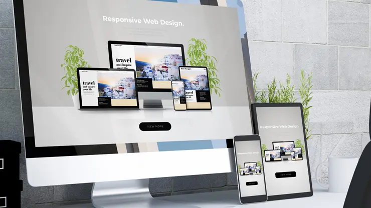

A website is not a “design project.” It is a sales tool, a trust builder, and often your first impression. The wrong web designer can cost you months of delays, wasted budget, weak leads, and a site you cannot update without begging for help.
This guide gives you a practical, step-by-step way to choose the right web designer, avoid common traps, and hire with confidence.
Start here: define what “success” looks like
Before you look at portfolios, get clear on outcomes. A great-looking website that does not convert is still a bad website.
Write down:
- Primary goal: leads, calls, bookings, purchases, quote requests
- Target audience: who they are, what they care about, what questions they have
- Top actions: what you want visitors to do on mobile and desktop
- Scope: new site, redesign, landing pages, SEO refresh, conversion improvements
- Timeline: ideal launch date plus a realistic buffer
- Budget range: ballpark is fine, but do not hide it
If a designer does not ask about goals and conversions, that is your first warning sign.
10 red flags to watch for when choosing a web designer
These are the “avoid disaster” signals that usually show up early.
- They talk only about aesthetics, not results, users, or conversion paths.
- They cannot explain their process in plain English (discovery, wireframes, design, build, QA, launch).
- No performance plan: they ignore speed, mobile UX, image optimization, Core Web Vitals.
- They will not give you ownership of the domain, hosting logins, and final site assets.
- Vague pricing or unclear scope, especially “unlimited revisions” without boundaries.
- No written agreement that covers deliverables, timelines, payment milestones, and what happens if things change.
- They rely on templates only, but charge custom pricing, or refuse to show what is truly custom.
- They avoid SEO basics like title tags, headings, internal linking, structured content, and indexability checks.
- They cannot show relevant work in your industry or for your business model (local service, B2B, ecommerce).
- They disappear during the sales process or take days to answer simple questions.
If you see two or more of these, keep shopping.
The #1 mistake people make when hiring a web designer
They choose based on a portfolio screenshot.
A portfolio can be beautiful and still fail at:
- clarity of messaging
- mobile usability
- speed and technical quality
- accessibility
- lead flow and tracking
- SEO structure that helps pages rank
Your job is to hire for outcomes and execution, not just visuals.
Step-by-step: how to choose the right web designer
Step 1: Decide what type of partner you need
There is no universal “best.” The right fit depends on complexity and risk.
Freelancer can be great if you have:
- a clear scope
- a smaller site
- strong internal direction
- low complexity integrations
Agency can be better if you need:
- strategy + copy + design + development
- SEO planning
- advanced features (booking, ecommerce, membership, CRM)
- ongoing support and multiple specialists
Rule of thumb: If the site is critical to revenue, choose the partner with the strongest process and support.
Step 2: Use a shortlist filter before you ever hop on a call
Look for proof in public:
- Their website loads fast and works well on mobile
- Clear positioning: who they help and what problems they solve
- Case studies that show outcomes, not just mockups
- Reviews/testimonials that mention communication, deadlines, and support
- Transparent process and what is included
If they cannot demonstrate competence on their own site, it is fair to be cautious.
Step 3: Vet the portfolio like a creative director
Do not just ask “does it look good?” Ask “does it work?”
Pick 2 to 3 portfolio examples and check:
- Mobile experience: tap targets, sticky headers, easy-to-find CTA buttons
- Messaging: do you immediately understand what the business does?
- Speed: does it feel snappy, or heavy and slow?
- Consistency: typography, spacing, and alignment look intentional
- Conversion path: what happens after you click the main CTA?
- Content structure: headings are logical, pages are easy to scan
If they show only Dribbble-style mockups and not live sites, ask why.
Step 4: Ask the 7 questions that reveal quality fast
These questions force clarity and expose weak process.
- What is your process from discovery to launch?
Listen for structured steps, not “we just start designing.” - How do you handle mobile-first design and performance?
Look for specifics: image compression, lazy loading, font optimization, caching. - Who writes the copy and plans the page structure?
Great design needs great content. If they say “just send text,” ask how they’ll improve it for clarity and conversions. - How do you approach on-page SEO basics?
You want: clean headings, internal linking, indexability, metadata support, and content structure that matches user intent. - How do revisions work, and what counts as a change in scope?
This prevents budget explosions and endless delays. - Who owns the domain, hosting, and website assets at the end?
The correct answer is: you do. - What happens after launch?
Ask about training, support plans, backups, security updates, and how they handle fixes.
If a designer struggles to answer these clearly, keep looking.
Step 5: Confirm what you will actually receive (deliverables checklist)
A professional project should include most of the following:
- discovery and goals alignment
- sitemap or page plan
- wireframes or layout planning
- design concept and style direction
- mobile responsive implementation
- basic technical SEO setup
- speed optimization plan
- analytics setup guidance (GA4 or equivalent) and conversion tracking plan
- contact forms tested end-to-end
- security basics (SSL, updates, spam protection)
- launch checklist + post-launch QA
- access credentials and ownership transfer
- training or handoff documentation
If they cannot list deliverables, you are buying uncertainty.
Step 6: Understand pricing without getting ripped off
Pricing varies widely. Instead of chasing the cheapest quote, compare value per outcome.
Ask for pricing that is tied to:
- number of templates or page types
- content support (copy, images)
- integrations (CRM, booking, ecommerce)
- SEO setup depth
- timelines and milestones
- support after launch
Be wary of a low price that excludes everything important, then sells it as “add-ons.”
Step 7: Protect yourself with a simple, clear agreement
Your agreement should spell out:
- scope and deliverables
- project timeline and responsibilities
- payment schedule tied to milestones
- revision limits and change request process
- who provides content and by when
- ownership of site, code, and design files
- hosting and maintenance expectations
- what happens if either party pauses or ends the project
If they resist putting things in writing, that is a major red flag.
Quick “web designer” traps to avoid
- The hostage site: you cannot access hosting, domain, or admin because it is “managed for you.”
- The mystery builder: they use a locked system that makes switching providers painful.
- The slow-motion project: no milestones, no deadlines, no accountability.
- The pretty-but-dead site: gorgeous design, weak messaging, no CTA clarity.
- The SEO illusion: they promise rankings without talking about content, intent, and technical foundations.
A simple scoring rubric you can use today
Score each candidate 1 to 5:
- Process clarity
- Communication speed and professionalism
- Portfolio relevance to your business model
- Mobile UX and performance competence
- SEO fundamentals awareness
- Ownership and transparency
- Post-launch support plan
Pick the highest total, not the prettiest screenshot.
FAQ (People Also Ask style)
What should I ask a web designer before hiring?
Ask about process, mobile performance, SEO basics, revisions, ownership, and post-launch support. If they cannot answer clearly, it is a risk.
How do I know if a web designer is a good fit?
They understand your business goals, ask smart questions, explain a clear process, and show relevant results, not just visuals.
Should I hire a freelance web designer or an agency?
Freelancers can be great for smaller, well-defined projects. Agencies are often better for higher-stakes sites that need strategy, SEO, integrations, and ongoing support.
Who should own the domain and hosting?
You should. A designer can manage it, but the accounts should be in your name with your access.
Final checklist before you sign
Before you hire, make sure you have:
- a clear scope and goals
- a written proposal with deliverables
- a timeline with milestones
- ownership terms in writing
- a revision and change process
- a post-launch plan
If all of that is true, you are not guessing. You are hiring with confidence.
Call to action
If you want a website that loads fast, looks sharp, and is built to convert, choose a designer who can prove process, performance, and outcomes. Start by sending your goals, your current site (if any), and 3 competitor sites you like. A good partner will turn that into a clear plan, not vague promises.
Usability is about people and how they understand and use things, not about technology.
5) Improve mobile speed where it impacts revenue
Speed isn’t just a technical metric. It’s a conversion lever.
What to do
- Compress images and serve modern formats (WebP/AVIF)
- Lazy-load below-the-fold content
- Defer non-critical scripts (chat widgets, heavy animations)
- Prevent layout shift by reserving space for media and embeds
Why it increases conversions
Fast, stable pages reduce bounce and keep prospects moving toward contact points, improving lead volume and quality.
6) Build credibility that fits the screen
B2B buyers need proof, but mobile-proof needs to be readable.
What to do
- Use short testimonial cards (2–3 lines) with role/company
- Show 1–2 quantified outcomes (for example: “Reduced processing time by 28%”)
- Place proof near CTAs and forms, not buried at the bottom
- Avoid tiny logo soup that becomes unreadable on mobile
Why it increases conversions
Credibility reduces perceived risk. When trust is immediate, CTAs feel safer, and conversions rise.
7) Simplify mobile navigation for buying intent
Your mobile menu is not a sitemap. It’s a conversion tool.
What to do
- Limit the menu to high-intent items: Solutions, Pricing, Case studies, About, Contact
- Surface pricing context early (even if it’s “starting at” or packages)
- Add jump links on long pages so users can reach proof and offers instantly
- Keep a clear “Talk to Sales” path available from anywhere
Why it increases conversions
When prospects find what they need quickly, they move through evaluation faster, increasing sales conversations.
Quick mobile conversion checklist
Use this as your internal scorecard:
- One primary CTA above the fold
- Sticky bottom CTA bar
- Decision blocks with proof near CTAs
- 2-step mobile form with autofill and trust cues
- Optimized images and deferred scripts
- Readable social proof (not tiny logos)
- Menu built for intent, not completeness
Want more leads from your mobile traffic?
If you’re getting mobile visits but not enough inquiries, the issue is rarely “more traffic.” It’s usually friction, unclear paths, or missing trust on smaller screens.
Next step: Schedule a mobile conversion audit and we’ll identify the top responsive layout changes that will create the fastest lift in B2B leads.