
Business professionals don’t “browse” on mobile. They scan, evaluate credibility fast, and decide whether you’re worth a meeting. If your mobile experience is slow, cluttered, or difficult to act on, you don’t just lose traffic. You lose sales opportunities.
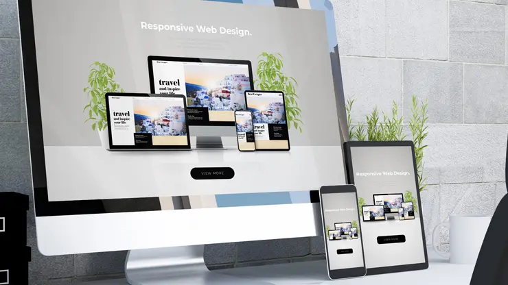
A well-executed web design does more than look good. It removes friction, builds trust quickly, and guides action from the first tap. Below are 7 high-impact mobile responsive layout upgrades that directly increase B2B conversions.
1) Design the first mobile screen for one conversion goal
On desktop, you can support multiple paths. On mobile, competing options dilute attention.
What to do
- Choose one primary action: Schedule a demo, Request a quote, or Start a trial
- Write a clear, outcome-based headline that answers: “What do you do and why should I care?”
- Place the primary CTA and a short trust cue above the fold (for example: response time, client logos, industry focus)
Why it increases conversions
Business professionals make quick judgments. A focused mobile hero reduces decision fatigue and increases CTA taps.
2) Add a thumb-friendly sticky CTA that stays available
If your CTA disappears after the hero, mobile users often won’t hunt for it again.
What to do
- Implement a sticky bottom CTA bar (one primary, one secondary)
- Use large tap targets (at least 44px height)
- Keep CTA text specific: Book a 15-minute call beats Contact us
Why it increases conversions
A persistent CTA shortens the distance between interest and action, capturing intent the moment it appears and increasing demo bookings and form starts.
3) Restructure content into mobile “decision blocks”
Long B2B pages often fail on mobile because they’re written like brochures, not conversion flows.
What to do
- Rebuild sections into a simple sequence: Problem → Outcome → Proof → Offer → CTA
- Turn feature lists into benefit bullets with measurable results
- Use accordions for details (FAQs, specs), keeping the decision-making content visible
Why it increases conversions
Decision blocks help buyers confirm fit faster, reducing scroll fatigue and increasing progression to pricing, proof, and contact actions.
4) Make forms fast, low-friction, and trust-driven
Mobile forms are where most B2B conversion leaks happen.
What to do
- Reduce fields to only what you truly need
- Split into a 2-step form
- Step 1: name + email
- Step 2: company + role + short message
- Enable autofill and correct keyboard types
- Add reassurance near the submit button: privacy line, expected response time, “what happens next”
Why it increases conversions
Less friction means more completions. Better trust cues reduce hesitation, increasing qualified lead submissions.
Usability is about people and how they understand and use things, not about technology.
5) Improve mobile speed where it impacts revenue
Speed isn’t just a technical metric. It’s a conversion lever.
What to do
- Compress images and serve modern formats (WebP/AVIF)
- Lazy-load below-the-fold content
- Defer non-critical scripts (chat widgets, heavy animations)
- Prevent layout shift by reserving space for media and embeds
Why it increases conversions
Fast, stable pages reduce bounce and keep prospects moving toward contact points, improving lead volume and quality.
6) Build credibility that fits the screen
B2B buyers need proof, but mobile-proof needs to be readable.
What to do
- Use short testimonial cards (2–3 lines) with role/company
- Show 1–2 quantified outcomes (for example: “Reduced processing time by 28%”)
- Place proof near CTAs and forms, not buried at the bottom
- Avoid tiny logo soup that becomes unreadable on mobile
Why it increases conversions
Credibility reduces perceived risk. When trust is immediate, CTAs feel safer, and conversions rise.
7) Simplify mobile navigation for buying intent
Your mobile menu is not a sitemap. It’s a conversion tool.
What to do
- Limit the menu to high-intent items: Solutions, Pricing, Case studies, About, Contact
- Surface pricing context early (even if it’s “starting at” or packages)
- Add jump links on long pages so users can reach proof and offers instantly
- Keep a clear “Talk to Sales” path available from anywhere
Why it increases conversions
When prospects find what they need quickly, they move through evaluation faster, increasing sales conversations.
Quick mobile conversion checklist
Use this as your internal scorecard:
- One primary CTA above the fold
- Sticky bottom CTA bar
- Decision blocks with proof near CTAs
- 2-step mobile form with autofill and trust cues
- Optimized images and deferred scripts
- Readable social proof (not tiny logos)
- Menu built for intent, not completeness
Want more leads from your mobile traffic?
If you’re getting mobile visits but not enough inquiries, the issue is rarely “more traffic.” It’s usually friction, unclear paths, or missing trust on smaller screens.
Next step: Schedule a mobile conversion audit and we’ll identify the top responsive layout changes that will create the fastest lift in B2B leads.