

Table of Contents
Introduction
Context and goals for startup founders
At INTELLIPLANS we treat a startup’s landing page as a core growth asset, not a decorative billboard. It should quickly convey value, capture qualified leads, and scale with product milestones. Your goals: convert visitors into meaningful actions, test assumptions rapidly, and learn which messaging resonates through real user data.
Practically, align copy, visuals, and forms around a single measurable outcome per page. Start with a clear hypothesis about who you serve and why your solution matters, then validate via real user interactions and analytics. For example, run a 2-week test with a locked value proposition, a single hero CTA, and a simple form to gauge intent.
Why a high-converting landing page matters
A high-converting landing page accelerates early traction, shapes investor perception, and feeds product feedback loops. It pre-qualifies interest before sales conversations, reducing wasted outreach and speeding learning.
- Lead quality improves when visitors self-select into a focused value proposition, lowering cost per acquisition over time.
- Clarity matters a distraction-free design helps visitors grasp the offer in 3 seconds, accelerating action.
- Framing above-the-fold value and decisive CTAs shortens the path from curiosity to engagement.
INTELLIPLANS champions a balanced design that supports persuasive copy, credible proof, and frictionless capture, with every element tied to a defined business outcome.
Next, we outline how to frame your one irresistible offer, ensuring your message is immediately compelling to visitors.
1. Define Your One Irresistible Offer
Clarifying value proposition
Your value proposition is the core reason visitors should care. Define it as a concise promise that links a unique benefit to a specific audience segment, without jargon. For startup landing pages, aim for one sentence that answers who you help, what you deliver, and why it matters.
Why this matters: a precise proposition reduces cognitive load and guides all on page messaging, including headlines, bullets, and CTAs. Clear positioning also aids your lead generation by aligning expectations with real product capabilities.
Mapping benefits to customer pain points
List the top pains your solution alleviates, then translate each pain into tangible benefits. Prioritize benefits that are measurable and differentiating.
- Link benefits to outcomes like time saved, cost reductions, or risk mitigation. For example, show how a 15 minute daily task becomes 2 minutes with your tool.
- Use concrete examples or mini use cases to illustrate each point. A SaaS startup could cite a 30% faster billing cycle achieved for beta users.
- Tie every benefit to one offer and ensure the message remains consistent across sections.
| Pain Point | Benefit | Impact Metric |
|---|---|---|
| Manual processes slow onboarding | Automated onboarding flows | Reduced setup time by 40% |
| Fragmented support leads to delays | Unified customer communication | First response under 1 hour, higher satisfaction |
Next, translate this clear offer into your hero headline and supporting copy to ensure the entire page speaks with one voice. For INTELLIPLANS, couple the value proposition with a concrete onboarding efficiency metric to ground expectations.
2. Craft a Persuasive Hero Section
Compelling headline and subhead
The hero headline states the one irresistible outcome visitors will achieve, written in plain language. Pair it with a subhead that adds a tangible detail about scope, timeline, or result. This duo sets expectations and guides the next action.
Why it matters: a clear headline reduces friction and increases the likelihood that a visitor stays to explore. It directly influences initial engagement signals that matter for lead generation.
Immediate social proof and trust signals
Place credibility elements upfront without distracting from the primary action. Include a concise client logo row, a short testimonial, or a measurable result from a real customer. If available, show a third party badge or notable press mention near the hero.
Actionable steps:
- Show 1, 2 customer logos and a one sentence impact quote that ties to the headline.
- Include a concrete data point such as time saved, cost reduction, or conversion lift from a specific project.
- Position social proof within the fold so visitors see it within 3 seconds and it reinforces the value proposition.
3. Design for Focus: Distraction-Free Layout
Minimal navigation and above-the-fold clarity
A focused layout keeps the visitor on a single path: learn, decide, and act. Limit top navigation to essential links and hide secondary menus behind a simple options icon on mobile. Place the primary value prop and CTA above the fold so first impressions align with your one irresistible offer.
Why it matters: fewer on-page choices speed comprehension and improve lead quality by guiding users toward the intended action without detours.
Action you can take now: map the fold across desktop and mobile, prune navigation to three to five items, and ensure the primary CTA is visible without scrolling. For example, a SaaS landing page should feature a single hero CTA like “Start Free Trial” and a secondary contact option tucked under a discreet menu.
Whitespace and visual hierarchy
Whitespace helps readers scan your page and focus on the most important elements. Use generous margins around the hero block, readable line lengths, and a clear typographic scale to establish a predictable flow.
Why it matters: a clean hierarchy reduces cognitive load, making benefits and CTAs stand out, which supports higher engagement and better lead generation.
Action you can take now: define a visual rhythm with 3-4 type sizes, 1-2 accent colors, and consistent spacing so the eye naturally lands on the CTA. Test two contrasting hero headlines to see which drives more clicks, and use Google Analytics events to measure clicks on the primary CTA.
4. Lead Form Strategy that Converts
Form length, fields, and incentives
Keep forms tight while still gathering the essentials needed to qualify a lead. Target 3 to 5 fields that reveal identity and intent, for example name, work email, company size, and a single qualifier question tied to buying intent.
Why it matters: fewer fields cut friction, and a well crafted value exchange boosts completion rates and downstream lead quality.
- Eliminate non essential fields and apply smart defaults, such as auto filling company or industry when possible.
- Use one clear qualifier question to segment leads for faster assignment and personalized follow up.
- Offer a tangible incentive aligned with the next step, like a 2 minute checklist, product tour, or 10 minute consult slot.
Practical setup: for a software solution, use fields: name, business email, company size, and a checkbox like “I’m evaluating for a current project.” Pair with an incentive such as a concise ROI calculator gated behind the form.
Above the fold placement and CTA design
Ensure the lead form sits in the first viewport and the CTA uses strong contrast that aligns with the page’s color system. Use a single primary CTA with copy that mirrors the value the visitor receives.
Why it matters: immediate access plus decisive copy increases early engagement and supports meaningful micro conversions.
- Label fields with concise, benefit oriented prompts, e.g. “Get the MVP Checklist” instead of generic prompts.
- Keep button text specific and outcome focused, such as “Schedule a 15 minute Review” or “Get the MVP Checklist.”
- Include a brief privacy note nearby to reduce hesitation, for example “We’ll never share your data.”
Implementation example: test two variants of the CTA color and wording over a two week period using Google Analytics goals and Google Optimize to measure impact on form submit rate.
5. Clear CTAs and Micro-Conversions
CTA copy that aligns with user intent
Craft CTA text that mirrors the visitor’s immediate goal with concrete phrasing. For example, use “Get the Free Checklist,” “Start Your Trial,” or “Watch the Demo” to signal the next action clearly. Keep the wording tight and specific to what happens next, such as “Download the Guide” or “Book 15-Minute Call.”
Why it matters: precise CTAs remove guesswork, boost click through rates, and help sales teams focus follow up on genuinely interested prospects.
Strategic secondary actions and downsell options
Provide secondary actions that align with nearby intent without distracting from the primary conversion. For instance, pair a strong CTA with a lower commitment option like “View Pricing” or a concise explainer video behind a lightweight play button.
Why it matters: secondary actions capture users who aren’t ready for the main offer, creating a nurturing path and reducing drop-off.
- Position the primary CTA in a high contrast button near the lead form or hero.
- Offer a secondary action that delivers immediate value, such as a teaser demo or resource download.
- Test variations of both primary and secondary copy to match different intents at the top of the funnel.
6. Social Proof and Credibility Elements
Customer logos, testimonials, and case studies
Social proof anchors trust by showing real outcomes. Use a rotating strip of recognizable logos from current customers and pair them with short, outcome-focused quotes. Include case studies that quantify impact with a clear before/after narrative.
Why it matters: credible references reduce perceived risk and speed up decisions for early-stage buyers.
- Show a carousel of 6, 8 logos from firms you’ve helped recently, with 1, 2 sentence outcomes per logo.
- Pair quotes with roles and company sizes to signal relevance to target segments.
- Link to 2, 3 short case studies that clearly state the problem, approach, and measurable results.
Trust seals and data-driven proof
Trust signals beyond logos improve confidence. Add privacy and security badges, plus data-backed proof such as uptime, user adoption, or ROI estimates drawn from verifiable sources.
Why it matters: data-driven proof strengthens credibility and supports higher-quality engagement from qualified leads.
- Position a concise trust seal near the primary CTA to reinforce safe conversion actions.
- Tell a single metric story per page to keep focus and avoid clutter.
- Use current data attributed to a credible source or an internal dashboard, and refresh quarterly.
7. Visual Assets that Accelerate Understanding
Product screenshots, demos, and explainer visuals
Show the full task flow rather than isolated features to demonstrate real user value. Use annotated callouts that map each step to a concrete goal, such as onboarding time reductions or error rate improvements. Pair visuals with captions that translate visuals into tangible benefits.
- Show the user journey end to end in a sequence of screens to reinforce context.
- Keep visuals aligned with the current UI to prevent confusion.
- Limit overlay text and rely on surrounding copy for explanation.
Video use and play-time considerations
Describe the product succinctly in under 60 seconds and demonstrate a measurable outcome, such as time saved per task or a reduction in defects. Design for autoplay muted with captions so mobile users or noisy environments can understand the message. Define a single objective for the video and a clear path to the next action after it ends.
- Embed a short product tour near the hero or behind a lightweight play button.
- Track engagement with event triggers like play, pause, and completion to guide follow-up.
- Prefer square or vertical formats for mobile first viewing to maintain clarity across devices.
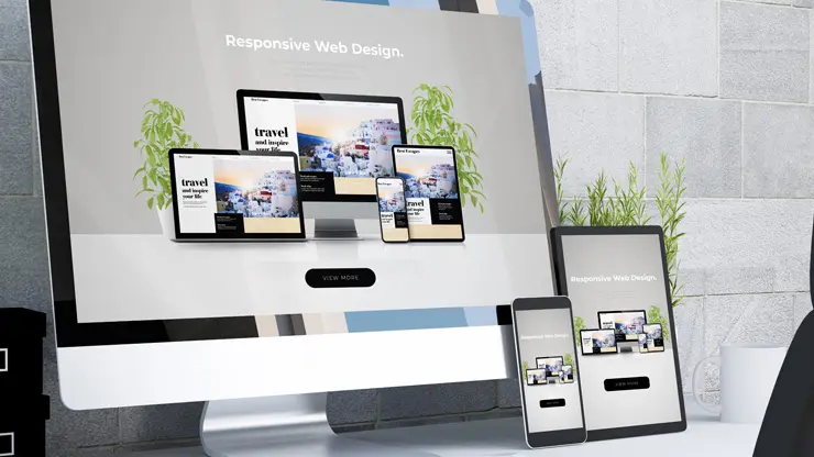
Web design is no longer about building static pages for users to view; it is about creating dynamic, responsive spaces that adapt to how users interact in real-time.
FAQ
This section answers common questions founders have when building a startup landing page that converts. Each item focuses on practical actions you can implement today.
What is the best headline length for a startup landing page?
Aim for a concise headline that communicates the core value in 6 to 10 words. Pair it with a subhead that expands on the benefit in 1, 2 sentences. This keeps above the fold clear and skimmable for busy visitors. For example, a fintech startup could use “Automate Invoice Reconciliation in Real Time” with a subhead like “Cut 80% of manual workload and reduce errors with our cloud platform.”
How many fields should a lead form have?
Start with four fields or fewer. Prioritize essential information such as name and email, then add one targeted qualifying field if it meaningfully improves lead quality. Longer forms deter completion and reduce conversion rate. Test a two-field form versus four fields to quantify lift in qualified leads per visit.
Where should I place the call to action?
Place the primary CTA above the fold near the hero copy, and again after the benefits section for readers who scroll. Use a single, high-contrast button with action-oriented copy aligned to the visitor’s intent. Example: “Get Early Access” for a product launch or “Start Free Trial” for a SaaS tool.
What role does social proof play in conversions?
Social proof reduces perceived risk and accelerates trust. Include recognizable logos, brief testimonials, and a short case study that quantifies a verified outcome. Ensure proof is current and relevant to your target segments. If possible, feature a 1, 2 sentence case study with a concrete result and a verifiable metric.
How can I test my landing page effectively?
Run a controlled A/B test on one element at a time, such as headline, CTA color, or lead form length. Use credible metrics like lead quality, times to convert, and bounce rate to determine what resonates with your audience. Implement results in a single page cycle; re-test after major copy or design changes.
What creates a distraction-free design?
Remove non-essential navigation, limit on-page links, and keep imagery aligned with the offer. Clean typography and consistent spacing help readers process the value proposition quickly. Use a simple color palette and remove competing banners or widgets.
Conclusion
A high converting landing page begins with a precise offer and a distraction free layout. Align every element from the hero to the lead form around a single, measurable action to create a predictable path for visitors ready to engage.
Next steps involve building a minimal viable version of your page that prioritizes above the fold clarity, concise persuasive copy, and a streamlined lead capture. This approach makes it possible to test with real user data rather than assumptions.
- Articulate your value proposition in concrete, outcomes focused terms that speak to each target segment. Replace vague promises with specific results and a measurable metric your buyer cares about.
- Ensure the layout remains responsive so mobile users experience the same conversion leverage as desktop users. Use a single column on small screens and verify tap targets meet accessibility standards.
- Iterate one element at a time, guided by credible metrics such as conversion rate, scroll depth, and form completion rate, rather than gut feel.
At INTELLIPLANS we view landing page design as a systems problem where content clarity, visual hierarchy, and conversion psychology work in concert. The approach relies on data from analytics tools and internal dashboards to drive measurable improvements in lead quality and engagement.
Next steps: map your core KPI to the page structure, ensure your CTA matches user intent, and prepare a small set of scenarios to validate during rapid iterations. This method keeps your startup landing page focused on meaningful progress and real outcomes, not decorative polish.
References
- YC Landing Pages: 180 Proven Templates and Conversion Guide
- How to Optimize your landing page for new leads – YouTube
- Effective Landing Page Design for Startups – Fourmeta
- Framer Blog: How to create a landing page that converts: 8 proven …
- Here’s my formula for a startup landing page introduction… – Reddit